![[Previous]](prev.gif) |
![[Contents]](contents.gif) |
![[Index]](keyword_index.gif) |
![[Next]](next.gif) |
![[Previous]](prev.gif) |
![[Contents]](contents.gif) |
![[Index]](keyword_index.gif) |
![[Next]](next.gif) |
This chapter covers the following topics:
When you build an application, you typically use the standard widgets provided with the Photon widget library. But occasionally you'll have a reason for not using these standard widgets.
For example, Photon widgets require a fair amount of memory, so if you're drawing a diagram having several PtRect, PtLine and PtPolygon widgets, it might be better to create a single widget that can draw the entire diagram using Pg*() graphic primitives.
Another reason for creating a custom widget is the need for a user interface object whose features aren't supported by standard widgets. In this case, you have three options:
Placing custom user-interface code within a widget has its advantages:
The process of building a widget in Photon is very straightforward. Because all widgets follow a specific structure or layout, you can start with a standard widget template or an existing widget that has similar functionality.
Building a custom widget is also known as subclassing a widget because widgets are always built as descendants of existing widget superclasses. Subclassing lets you enhance or modify the behavior associated with an existing widget superclass, provided you understand how the superclass is implemented. The Using Widget Superclasses chapter describes the most common widget superclasses.
When creating a custom widget, you should subclass it under PtBasic or one of PtBasic's subclasses. The PtBasic superclass is the ancestral widget class of most standard Photon widgets. Subclassing a widget under PtBasic lets the widget inherit the features common to most Photon widgets, such as support for keyboard traversal, highlighting, and focus. If you create a widget that doesn't support these common features, it may look out of place in a Photon application.
 |
If you'll be adding a custom widget to the Photon Application Builder (PhAB) widget palette, there are a few special design considerations you must be aware of. Before you begin designing your widget, read the Binding Widgets into PhAB chapter. |
Part of building a custom widget involves deciding what it will look like and how the user will interact with it. You'll need to decide on the resources that control the widget and pick an appropriate widget superclass to start with.
When deciding on these attributes, consider how to represent them in the widget's instance structure. For example, will the attribute be a string, a structure, or a pointer to an allocated array? Each of these attributes (whether they are read, write, or read/write) will be your widget's resources.
You can have all events go through the same function, or you can define a function for each event type. The functions that handle events should read the event data and take the appropriate action. For example, a click on your widget might change its internal state. If appropriate, your widget may need to be damaged so a subsequent redraw operation can reflect the widget's new state.
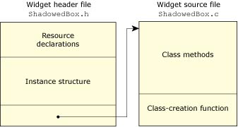
A widget is usually made up of two files:
The following diagram depicts the header and source code files for a simple example of a widget, ShadowedBox.

The header file and source file for a widget class.
This sample widget will draw a shadowed box, define a resource for changing the color of the shadow, and define a resource for specifying the offset of the shadow.
This sample widget will be subclassed as follows:
PtWidget → PtBasic → ShadowedBox
Since ShadowedBox will be a subclass of PtBasic, it will inherit all the resources and behavior of this standard Photon widget.
Photon widgets comprise two structures: the class structure and the instance structure. The class structure is defined in the source file and is discussed in the next section. The instance structure is contained in the header file, as shown below in an excerpt from the ShadowedBox.h header file:
/* ShadowedBox.h - widget header file */

#include <Pt.h>

/* widget resources */
#define SBW_SHADOW_COLOR      Pt_RESOURCE( Pt_USER( 0 ), 0 )
#define SBW_SHADOW_OFFSET     Pt_RESOURCE( Pt_USER( 0 ), 1 )

/* widget instance structure */
typedef struct shadowed_box_widget{
   PtBasicWidget_t   basic;
   PgColor_t    shadow_color;
   short        shadow_offset;
}  ShadowedBoxWidget;

/* widget class pointer */
extern PtWidgetClassRef_t *ShadowedBox;
Each instance of a widget has its own copy of the instance structure, which carries the complete widget state including everything that can be unique to that instance. Widgets define public resource manifests, which correspond to the members of the instance structure.
The first member of the instance structure must be the instance structure of the widget's immediate superclass. ShadowedBox is a subclass of PtBasic, so the first member of its instance structure is of type PtBasicWidget_t.
When a widget class is created, the members of the instance structure are given default values or can be set using resource manifests. The instance structure members can be changed by calling PtSetResources() and read by calling PtGetResources().
The header file also defines an external reference to the widget class pointer.
The organization of the source file is quite simple. First, it defines the class structure. There's only one copy of the class structure, which all widget instances use. It's initialized through the class-creation function when the first instance of this class is created.
The class structure's members contain pointers to methods and resources that control how the Photon library handles instances of this class.
The following class structure is found in the ShadowedBox.c source file:
/* ShadowedBox.c - widget source file */

#include "ShadowedBox.h"

/* prototype declarations */
PtWidgetClass_t *CreateShadowedBoxClass( void );

/* widget class pointer - class structure, create function */
PtWidgetClassRef_t WShadowedBox = { NULL,
                                    CreateShadowedBoxClass };
PtWidgetClassRef_t *ShadowedBox = &WShadowedBox;

//
// ShadowedBox defaults function
//
static void shadowedbox_dflts( PtWidget_t *widget )
{
    ShadowedBoxWidget    *sb = ( ShadowedBoxWidget * ) widget;
    PtBasicWidget_t      *basic = ( PtBasicWidget_t * ) widget;

    basic->fill_color    = Pg_WHITE;
    sb->shadow_color     = Pg_BLACK;
    sb->shadow_offset    = 4;
}

//
// ShadowedBox draw function
//
static void shadowedbox_draw( PtWidget_t *widget, PhTile_t *damage )
{
    ShadowedBoxWidget    *sb = ( ShadowedBoxWidget * ) widget;
    PtBasicWidget_t      *basic = ( PtBasicWidget_t * ) widget;
    PhRect_t             shadow_rect, rect;
    PgColor_t            color;

    // We want to use basic's draw function to get borders
    // and default focus rendering... but we don't want it to
    // fill the background with the basic fill color,
    // so we set the fill color to transparent for Basic's draw func.
    color = basic->fill_color;
    basic->fill_color = Pg_TRANSPARENT;
    PtSuperClassDraw( PtBasic, widget, damage );

    // we don't want to draw outside our canvas! So we clip.
    PtCalcCanvas( widget, &rect );
    PtClipAdd( widget, &rect );

    basic->fill_color = color;
    shadow_rect = rect;
    shadow_rect.ul.x += sb->shadow_offset;
    shadow_rect.ul.y += sb->shadow_offset;
    PgSetStrokeColor( sb->shadow_color );
    PgSetFillColor( sb->shadow_color );
    PgDrawRect( &shadow_rect, Pg_DRAW_FILL_STROKE );

    PgSetFillTransPat( basic->trans_pattern );
    PgSetStrokeColor( basic->color );
    PgSetFillColor( color );
    rect.lr.x -= sb->shadow_offset;
    rect.lr.y -= sb->shadow_offset;
    PgDrawRect( &rect, Pg_DRAW_FILL_STROKE );

    /* remove the clipping */
    PtClipRemove();
}

//
// ShadowedBox class creation function
//
PtWidgetClass_t *CreateShadowedBoxClass( void )
{
    // define our resources
    static PtResourceRec_t resources[] = {
        SBW_SHADOW_COLOR, Pt_CHANGE_REDRAW, 0,
            Pt_ARG_IS_NUMBER( ShadowedBoxWidget, shadow_color ), 0,
        SBW_SHADOW_OFFSET, Pt_CHANGE_RESIZE_REDRAW, 0,
            Pt_ARG_IS_NUMBER( ShadowedBoxWidget, shadow_offset ), 0,
        };

    // set up our class member values
    static PtArg_t args[] = {
        { Pt_SET_VERSION, 110},
        { Pt_SET_STATE_LEN, sizeof( ShadowedBoxWidget ) },
        { Pt_SET_DFLTS_F, (long)shadowedbox_dflts },
        { Pt_SET_DRAW_F, (long)shadowedbox_draw },
        { Pt_SET_FLAGS, 0, Pt_RECTANGULAR },
        { Pt_SET_NUM_RESOURCES,
          sizeof( resources ) / sizeof( resources[0] ) },
        { Pt_SET_RESOURCES, (long)resources,
          sizeof( resources ) / sizeof( resources[0] ) },
        };

    // create the widget class
    return( ShadowedBox->wclass = PtCreateWidgetClass(
        PtBasic, 0, sizeof( args )/sizeof( args[0] ), args ) );
}
In the source file above, the class definition defines the shadowedbox_dflts() and shadowedbox_draw() functions for the Defaults and Draw methods. It also defines how the SBW_SHADOW_COLOR and SBW_SHADOW_OFFSET resources are handled.
As you can see from this example, creating a simple widget doesn't take a lot of code.
Let's review the fundamental structure of a widget source code file:
| Section | Example |
|---|---|
| Header files | #include "ShadowedBox.h" |
| Class pointer declaration | PtWidgetClassRef_t *ShadowedBox |
| Method functions | shadowedbox_dflts(), shadowedbox_draw() |
| Class-creation function | CreateShadowedBoxClass() |
The Photon library supplies a number of widget classes that can be used as the basis for custom widgets. To make this easy to understand, we've categorized widgets into three general types:
All Photon widgets are based on the PtWidget core widget class. It defines the characteristics common to all standard widgets, such as position and dimension. Even if your widget is different from any other widget, it will still inherit the features of the PtWidget widget class. Most custom widgets, however, will be subclassed under one of the other widget superclasses.
PtWidget also supports anchoring features that allow widgets to be anchored to their parent.
Basic widgets are single-entity objects. They don't contain other widgets and aren't built from other widgets. An example would be a button widget.

Button widgets.
You can't put other widgets inside a button, and the button itself isn't built from other widgets. Our sample ShadowedBox widget is a basic widget.
Although we call them “basic” widgets, this is only a classification and doesn't imply that they can't be powerful. In fact, one of the most complex widgets in the Photon library, PtText, is a basic widget.
Container widgets can have other widgets as children. Containers have the option of managing the geometry of their children (e.g. PtGroup) or leaving the widgets as they are (e.g. PtContainer).
The PtContainer class extends the PtBasic class definition to include many new methods for controlling and reacting to the widget children placed inside the container. Using these new methods, a container could, for example, detect when a new child is added and automatically resize itself to accommodate the new widget.
Widget children can be selectively blocked by a child-redirector function. This is useful when you want to create a widget that accepts only specific widgets as children (e.g. PtMenuBar accepts only PtMenuButton widgets as children). All other widgets are redirected to the container's parent widget. This causes them to be created at the same level as the container instead of as a child of the container.

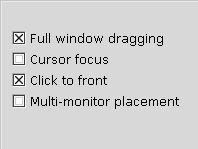
A container with toggle-button children.
Compound widgets are built from exported subordinate widgets. The exporting mechanism allows access to the underlying widgets using their resources and convenience functions. This reduces the need to duplicate every subordinate widget resource in the compound widget's resource list.
You have to set up resources only for new functionality or for resolving conflicts when more than one of the same widget class has been exported. A blocking mechanism lets compound widgets block access to any of the subordinate resources. This lets you prevent any actions that would adversely affect the look and behavior of the compound widget.
Since the PtCompound class is a descendant of PtContainer, it inherits all the functionality of a container widget. This means compound widgets can support child widgets other than the ones they're built from. Since this feature isn't usually desired, you can use a compound widget's child-redirector function to automatically reject the addition of unwanted widgets.
A good example of a compound widget is PtComboBox — it's built using the PtText and PtList widget classes and adds its own functionality.

A compound widget.
Another good example is PtDivider — it's built using a PtGroup widget; separator bars are added automatically between the widgets in the group.
![[Previous]](prev.gif) |
![[Contents]](contents.gif) |
![[Index]](keyword_index.gif) |
![[Next]](next.gif) |